Book N Tech
Showing posts with label Windows 8. Show all posts

Wednesday, December 11, 2013

Bing Maps Preview (3D) | App Review


Bing has come up with an app called Bing Maps Preview where you can view anything on Earth in 3D. It is probably similar to Google Earth but this might take up a little less resources from the computer. You can find it in the Windows Store for Windows 8.1+. I give this app a 5/5 for it's ease of use and coolness.


Tuesday, August 20, 2013

modTuner Windows 8 App Review

modTuner, windows 8 app review, Lloyd Slichenmyer, Book N Tech

     I was looking for an app to tune a guitar and this one was probably the most precise and accurate I could come up with. I mean, it was accurate, I strummed the guitar to a different note and it changed immediately. So If you are at the Windows Store looking for a tuner, you should check out modTuner and it's freeeeeeeeeeeeeee.
Design:
     The design is quite minimal. The GUI (graphical user interface) is quite easy and you really don't have to do any clicking. You can also read everything just fine.
Usage:
     This is really simple. It is basically automatic and even my parents could do it. All you have to do is start playing. Now I am very sure that you can use about any instrument. There is an option if you want to upgrade to Pro.
Overall:
     Great app overall and said by many people to be the most precise you can get. I give it a 5/5 stars because it does the job and it does it well! By the way, this app is freeeeeee!
     Happy coding :)

Thursday, July 25, 2013

comiXology app review


    Overview

              I know there are plenty of comic book reader friends out there looking for a review of the conglomerate known as comiXology a cross platform app that acts like a digital locker for your precious graphic goodies. Personally I'm a fan of a novel or a movie but a graphic novel acts like a good middle in the road to visualize what is happening without sound (unlike DeviantARTs newest motion books which are amazing, btw). So I decided to spring for comiXology despite a few bad reviews. Overall I thought app was good, had a large category of titles, and the design was good in theory but the app was sluggish some and there wasn't a home button.

Functionality

      It's kind of hard to define "functionality" for a comic book reader app, but if your talking guided panes view, large title category, some free titles, and good prices (noted I'm not the guy for comic book prices I'm going on rates for books then translating them into comic book prices) then you have to use the comiXology app. Buying comics require a credit card and an account even if you are just looking for free ones (like me). After a simple in app registration you can buy books to your hearts content without leaving the app (unlike Kindle) and reading them straight from the glorious cloud. Of course you can choose to download for offline reading for summer road trips where some graphic entertainment is essential. One thing I wasn't happy about (as usual) was the lack of sharing. Every app should use the sharing charm even if it just posts a message to social media saying your using/enjoying etc in comiXology and since it is a website where you can get graphic novels they should at least include a link which guarantees free marketing even if only about 5% of their users use it. So the core functionality is good only thing is the app isn't completely fluid and it can be a bit hard to maneuver around the app on a laptop.

Design

      This is a two fold part. First part is the main page/store. The use of rectangles/boxes has a template look but somehow it looks good. The store isn't hard to maneuver around and purchasing is easy. The reading experience is great feeling very gratifying. The guided view is my favorite and I really enjoy using it with the cool use of zooming and focusing on one pane instead of having to zoom in constantly. Design is good enough for this kind of app and can't see how you could improve it.

Conclusion

      4/5 Good app has some great bones with a great ecosystem. As a first time user I was using the app fluently after about 10 minutes of fiddling around. I am not a collector (don't have any big graphic novel collection just a few like a classic fav of mine Bone the first free one of course) or a big fan but the app as a novice was a great experience. I recommend it if you have an existing comiXology account with a big collection of media.

Tuesday, July 23, 2013

Great British Chef's app review!

Overview

     Never have I seen such an impressive Windows 8 app since My History Digest. The Great British Chef's app was featured by about every Windows 8 related Microsoft blog's plus the Windows Store labeled as the best app ever for Windows 8. Being Jamaican/Italian I was a bit leery on the British part but I decided to take the plunge regardless. I thoroughly used the app (thinking about making the oxtail recipe actually) and was pleased with the beautiful animations and how they put content first.

Functionality

      At first the app takes about 20 seconds to open which feels like eternity. I was pretty ticked off at the app for making me wait but then the app finally started working and I was like WOW! The app felt like butter with all the animations etc. It had every thing under the hood and more! The live tile worked, the animations made it look better, the way the app flowed with text was nice, and the snap view is amazing. Never have I seen an app that I couldn't fully capture with screenshots. Another nicety was the addition of videos showcasing recipes. The video function worked well and fast. The last benefit was the addition of sharing functions that made it feel fully functional.

Design

     Need I say more? The design as JJ might say is DYNAMITE!

Conclusion

5/5 This app is quickly becoming one of my favorites. Everything about the app was good not ONE bug.


Wednesday, July 17, 2013

The History of Tablets


Apple did not create the tablet. Just saying.

      Picture above shows Steve Ballmer now CEO of Microsoft holding up an old resistive screen tablet that ran on Windows XP which get this: came out before the iPad. Okay so I am not saying this looks like the iPad in any way or am I saying this tablet was successful because it wasn't, but I am saying the iPad only revolutionized the market not made it. At the time tablets were used strictly for business not play. But the iPad made a consumer friendly tablet albeit at low specs and high price so you could play Angry Birds, Fruit Ninja, or whatever else you do on your iPad. Then came along Google with Android which at first barely slowed down the iPad advance. Now iOS, Android, and Windows 8/RT tablets are all in a mud slinging fight for market share with no clear winner, but today I will take you on a trip down the proverbial memory lane from the days where the tablets of today would be pure science fiction.

The First Slow tablets

   Today modern tablets even cheap ones could easily outrun laptops of 2004. In the beginning, the first original tablet was developed by Acorn Computers called the Newspad in 1994. The pilot/trials for the tablet ended in Barcelona, 1997 killing the tablet and a dream, but that dream was relived by Microsoft as a bulky tablet PC made primarily for work places like hospitals. The tablet PC's running full Windows XP tablet edition were expensive, ugly, and had terrible sales. The cycle went on with Vista even debuting mini tablet PC's that no one ever remembered. Then along came Android with Android 1.4 debuting on the Archos 5. Obviously the device really was a lagfest compared to the quad core Androids of today. The OS was unheard of and untested before Google bought it. Now it did have a big hard drive for storing a lot of stuff and was powered by a 800 Mhz processor that let you play 720p at 24fps which today wouldn't be acceptable on a high end device.

A slew of other tablets came but in 2010 the Apple iPad featuring iOS catapulting tablets into mainstream popularity. The iPad made the tablet cool essentially even if it was critically received. The app store grew changing the way software was bought permanently from in stores to online breathing life into companies like: Zygna, Betaworks, and other app makers. iOS completely dominated the market despite pushback from Google with Honeycomb in 2011 which was like a fly on the wall compared to the Apple monopoly. Recently Google has made the "halo" brand of Nexus products that have helped lead the charge in taking back marketshare from the iOS juggernaut which has slowed it down to a point but the iPad still has the mindshare advantage. 
  
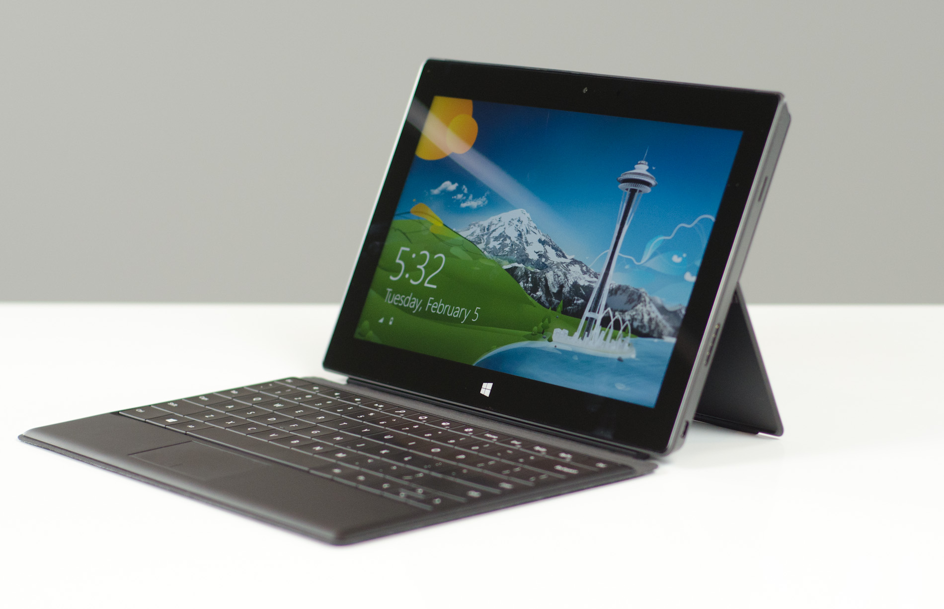
Surface Pro
Then along came Windows 8. Microsoft launched Windows 8/Windows RT on October 26th, 2012 officially jumping into the death ring known as the tablet market with the new touch friendly OS. Windows 8 did offer many improvements over Windows 7 but the Metro/Modern start screen was received with mixed reviews. The Surface RT/Pro was Microsoft's attempt at their own "halo" device as an example to other OEM's to make high quality hardware. The saga continues as Windows 8.1 a much better and more polished version of Windows 8 has been released to test and is supposed to hit RTM by August. 

The Future?
 That is a hard one to envision. Most likely can see tablets being thin, fast, replacing laptops, and possibly docakble to TV's. 


Monday, July 8, 2013

(official) Twitter for Windows 8 app review


Overview

A lot of times official apps for WP8 or Windows 8 really really stink. The original Twitter app for Windows Phone was terrible. They updated it with a similar look (suited for portrait mode of course) and a more cleaner minimalistic style. The Windows 8 version is much better than I originally would have expected so much so I decided against installing MetroTwit or Rowi.

Functionality

Well I do use Twitter a lot and the fact it updates its live tile with my latest interactions is really great. All I have to do is glance at the tile which saves time in my busy schedule. Another boon of the app is the 1/3 snap functions. It basically works like the WP8 app when you do a 1/3 snap (don't have Windows 8.1 so I can't do a 50/50 snap) it can do everything it does in regular mode a bit smaller though. That like Messenger makes it easier to multitask then having multiple windows open. It loads everything quickly with nice animations. Unlike other Twitter clients it shows all Twitter functions in a nice minimalistic view. The search is really useful and everything loads quick. You can share tweets from the app which I wasn't expecting a complete plus. I have literally NO complaints so far.

Design

As an ardent follower of MDL which says put content first the app design is clean and minimalistic. The design is a bit spare with some empty space not too much. The app design I really have no qualms over which is vastly superior to the website or clients like Tweetdeck.

4/5 An excellent app with an excellent design. I do deduct some points for not displaying Twitter page art which I have always liked. A background or even a gallery of tattoos for the home feed would be nice. If you do use Twitter a lot I recommend this app.


Saturday, July 6, 2013

Guns Windows 8 app review


Overview

Just about every platform has some kind of app that mimicks the sound of a gun like an M-16, Deagle, or .50 cal as a prank or just for fun. I installed the highly acclaimed Guns HD which closes as soon as I open it. This app had a surprisingly nice design with 8 guns and various achievements. It could use some work with bugs etc but overall nice experience.

Functionality

The app isn't hard to figure out. It has eight guns of various classes that you can tap to fire. I've had a couple of gun apps (albeit for Android) that I was surprised not as good as this app. Start up speed was average, the tile was nicely designed, and the app was very nice overall. No speed issues and the sounds were pretty authentic. The app doesn't have any sharing features or any settings which wasn't too surprising. The app never crashed on me and the animations are so - so. The sounds are pretty loud and the information was very well informational. The achievements could be good if they worked. Sometimes they do sometimes they don't. Obviously there are bugs to be fixed but the app was free so I can't really complain too much.

Design

This is where I give the app major kudos. The design for an app of this caliber (no pun intended) was phenomenal. It had a perfect MDL content first look and feel. Never have I seen an app with a (obviously) low budget have such a grand design. It does have its pitfalls like it doesn't have the best background (quality a bit low) but overall it is a winner for me. Information is well laid out and the typography is neat.

Rating

4/5 The design really resonated with me above the average functions for this "category" of apps. I was satisfied that the dev put enough effort into this app and its Windows Phone counterpart that we will see updates later on to make it a five star winner.


Sunday, June 30, 2013

Windows 8 App reviews are coming.... BACK!

One thing I must say to my readers is a big: I'm Sorry

I apologize for the lack of content in the past few months due to spending time on other projects. But thank the Lord that as the title says Windows 8 app reviews are coming back. Yes, people out there desperate for editorial like app reviews that are longer than the ones you might find in the Store. We will be reviewing them  as much as possible, frequently, with a lot of content!

Thursday, August 9, 2012

Windows 8 App review: Allrecipes

     Overview

         Windows 8 originally started out with 2 cookbooks: Cookbook by Bewise, and icookbook. Now we have 9 food and dining apps available in the store including the Allrecipes and videorecipes apps. I used to use the Cookbook by Bewise app, but it didn't have printing features. This app has a great printing feature, can share to virtually any app, and features the largest library of recipes that I have seen. The live tile is very beautiful and the layout is very intuitive. It could be faster, but that is yet to be seen for the Windows 8 release.

     Functionality

          I have used the website before and was very surprised to see a Windows 8 app. The app opens up in around 3 - 6 seconds or more depending on how many more programs running. After it loads it takes you to a beautiful and slightly cluttered home page. You can log into your Allrecipes.com account or join allrecipes.com to save recipes to your lunchbox. First comes up are ideas and then there is the ingredient section which shows you an ingredient and you can click on it to see recipes to get rid of your bacon from your fridge. There is a lot of creative ideas and recipes and you can always search for a recipe. The search is slow too and can take up to 12 seconds to load. Sharing is one of the Allrecipes app strong suits where I can share to any app that can share. There is a nutrition fact sheet that tells you all the calories and such. Not every recipe has them, but the majority do. There is a review section, but you can't add reviews. Allrecipes.com is user based, but you can't add recipes. Still this is a stellar app worth your time.

     Conclusion

     The app is very well designed and has a lot to love and little to hate. It is the only app that I know of that I visit more than the parent website.

Rating: 4 out of 5.

Tuesday, August 7, 2012

Windows 8 App review: PhotoVault

     Overview

     Usually I don't give apps 5 star ratings but when an app does everything it says it does pretty snappy it is hard to go lower. The app does have some ground to cover like more content and a sharing function. Still for what it offers it does. Channeling through the high res photos was as smooth as butter even on my T3400 Pentium dual core laptop. The app loads very quickly and the design is pretty simple at its base.

     Functionality

     It loads up very quickly even with a lot of other tasks open. Opening up categories takes around 2-4 seconds and can be a bit tedious waiting. Cycling through photos is very fast and has no lag at all. The pictures do not take up the full screen which is a bit weird, but I guess makes the app go a bit faster. The live tile is very pretty and has different picture from time to time. There are different categories and it is very slow loading them. The app itself is very low on content and the content itself is a bit smaller than it should be. The pictures look of high quality and the app itself is very well designed. Each of the pictures has a little description underneath talking a bit about it. 

     Conclusion

     There is not much to say about this app except it could use a little work, but so far so good!!
Rating: 5 out of 5

Friday, August 3, 2012

Windows 8 App review: Dictionary.com


     Overview

     Every good writer needs a very good dictionary. This is my personal recommendation over the middling competition. It has been available since the Consumer Preview, and little has changed except a few bug fixes. It does the job well, but is not the most feature packed app in the store. Also the design is very ho-hum. It does have "articles" called "The Hot Word" which talks about a word or once in a while a language that may seem a bit controversial or interesting. I really like the live tile which has a Word of the day which if you click the tile, go into the app, and click on the word it tells you what it means. The app start up times are slower than average and there is some noticeable lag inside of the app.

     Functionality

     The app may be extremely useful, but performance is very modest if not below average. The app itself is very light at 4.32 MB which should turn out to be very zippy. Sadly it was below expectations with only a word document open. It takes around 4-8 seconds to load almost at the 66MB Star Chart app. The search function is also slow and sometimes will not work if the dictionary app is not open. Still the search works great, and when you search for a word it shows a list of closely spelled words. It does what it advertises well even if a bit slow on some older hardware. I really loved the website and students would find this very functional given the snapped view mode. I love the app and I think you will too.

     Conclusion

     I loved the website and no longer visit it thanks to the Dictionary.com app! I really love everything about it except the lack of design. 
Rating// 4.5 out of 5

Wednesday, August 1, 2012

Windows 8 has hit RTM

Well finally after a lot of hard work Windows 8 has reached RTM. It will be available August 16th.

Source: Windows8Update

Tuesday, July 31, 2012

Windows 8 App review: Fine Cooking

     Overview

     I have always loved magazines and a good "magazine" app is hard to come by. This app shows true potential among the current crop of preview apps. The other magazine that I have reviewed My History Digest goes with a more web styled approach, but the Fine cooking magazine follows the path the Fine Homebuilder app took: the traditional magazine look and feel. The app has a lot of good features that all work unlike the Homebuilder app, and it also has a beautiful look and is pretty quick in app. The speed stops there. It took me 30 minutes to download 1 issue and there was only two to choose from. I was pretty disappointed at the lack of issues, but that is becoming very common among magazine apps before RTM. Another piece of criticism I have to give is that the text is too small for comfortable use. You are forced to view any content in zoomed view otherwise it is unreadable on a 1366x768 screen (a full HD screen renders text even smaller). In zoomed view you can not leaf to another page which forces you to exit the current view and then leaf over. Currently pages are rendered in two page mode so if it was rendered say in 1 page mode the problem would be fixed.

     Functionality

     Loading the main screen was pretty quick probably because there is nothing there. Loading up a pre-downloaded magazine takes about 4-6 seconds and there are some pictures of recipes that work part of the time. In a design aspect there is a lot of empty space that could be utilized by even a simple Office 15 like theme where they put flowers on the edges or lines you understand. It is not like the issues are even new they are from May and April. After you open your downloaded issue you have two options: 1 go to a recipe or 2 start reading the issue. Navigation is powered by the hated side buttons or if you click in the article you can use the left and right buttons. There is no fancy turning animations and the zoom function is not completely polished. There is a full screen mode which wastes some space on the side and the text is still too small for reading. If you try going through the magazine quickly then it starts to stutter and some pages do not display. There are some other functions like showcasing all of the articles in a grid or strip function. 

     Conclusion

     It did not provide the most pleasant experience, but still it laid a good groundwork for what looks to be a solid app come time for the RTM or Windows 8 release.
Rating// 3.8 out of 5


Monday, July 30, 2012

Windows 8 App review: Star Chart

     Overview

      I have not reviewed any Education apps yet and I am very excited to see one that rivals Google Skymap and Google Earth bringing them both into one good app. I could not try out the Augmented Reality function because I do not have a tablet yet. I will accept any people who would like to donate a Samsung Series 7 or if a Microsoft employee is reading has a Surface Pro lying around with palm block and the type cover I will gladly take one. :) Anyway this is some very cool stuff that the developer Escapist Games has made. One my third time of downloading the app it finally worked to my surprise. It is a very large app at 66MB, but that is expected for a lot of 3D models and a fully featured settings and sharing features. I was very happy to see a good feature packed app that has some decent sharing features. It is the slowest app that I own, and I am not giving it a free pass because it looks nice. There has to be ways to make the app faster on any machine or else it ruins the experience on all machines. If it can run on the Ipad smoothly than by golly they can make it run on Atom tablets!

     Functionality

     I was very disappointed to find an app that takes from 7 - 10 seconds to load. This is totally unacceptable. When it does load the app gets a big quicker, and loads up fast enough. Snapped view is nice and when you click on a star a cool sidebar pops up talking about where it is located, what it is, and has a handy zoom feature to see it up close. Looking at the planets is a lot like Google Earth, but some of the roving features and flight simulators is not here. When you exit the app and come back to it that is where the in app lag begins. Or if you are running other tasks it will take even longer to open the app, and going through settings and charms takes forever. Still if you have a good computer or if they update the app to run on slower hardware better than we may see some better performance. 

     Design

     I rarely go into design details on apps because they usually are the same and boring. This has some metro design aesthetics, but it feels like you are actually in the sky. It is not very hard for me to visualize what it would look like for the Augmented Reality mode. Simply you would hold the app to the sky and the e-compass and GPS sensors inside would determine which part of the sky you are looking at and display all of the stars on the map. It works like Google Sky and adding Google Earth modeled stars. The app is very pure and feels distraction free. It also shows you all of the constellations based on how they were modeled in the 15th century which is really cool. The entire catalog of stars is over 120,000 and even has a Search function baked in which is great for finding stars, galaxies, and planets if you have the name or Messier number. It updates in real time and features a night mode which essentially turns everything red. This is an excellently designed app and I would highly recommend schools utilizing this app. Sharing to Wordpress, journal by lifescribe, evernote, e-mail, and Quick Note. It also features a time lapse function that lets you go forward and backward seeing what the sky would look like. This app maintains a good score only because of the high quality design effort that was put into it. 

     Conclusion

     HD star models and a beautifully designed app is very hard to give a bad grade. But the lagginess of the app can't be missed which is why it scores 4 out of 5. Check out the slideshow below!!
Rating// 4 out of 5

Saturday, July 28, 2012

Windows 8 App review: Engadget

     Overview

     Engadget is a widely known source for all things things tech which is why I am reviewing this app. The other tech blogs that have approved Windows 8 apps are Ubergizmo, Appy Geek, and Tom's Hardware. I was surprised more than impressed with the appearance of the Engadget app. For a news blog that has some pretty critical reviews on Operating Systems and most Windows laptops they are not good at making a Windows 8 app. First off the article navigation is pretty solid, but the overall is pretty clunky like a few other apps. The app is a bit like the Ubergizmo setup or the Appy geek which looked like they were based heavily on a more default look.

     Functionality

     I frequent Engadget a lot for tech news and reviews and I thought this app might replace my need to visit the website. I was utterly wrong. First off it shows there is pictures on the home screen, but when you click on an article no pictures in any article. There is a gallery section with pictures oddly enough, but only from recent times. There is a video section with recent videos that do work. The app will never replace the website soon and according to the developer himself it is a "work in progress." Also no Distro app was very disappointing. The app loads up in 2 seconds and in app usage is very laggy. So far there really is no incentive to getting the app except for quick sharing to Facebook or twitter which works surprisingly well. If you do not care about pictures then this app would be great for you since you technically can go to the gallery section. What is surprising is when I go to certain articles from a category list it will not let me share at all stating that the app can't share! I was pretty baffled about this and was very angry. Navigation is very clunky in app at all times. If they took some cues from the Bible+ app I would be satisfied.

     Conclusion

     Well I was pretty surprised at a very critical company making an extremely poor app. Tom's Hardware or the regular News App are better. Engadget please make a good Distro app that looks along the lines of a Fine Cooking app. I really love the Android app and hope it looks the same, but metrofied. 
Rating// 3 out of 5


Wednesday, July 18, 2012

Windows 8 release date


     Well guess what we know when Windows 8 will be released!!! On October, 26, 2012 we will see droves of people heading to the big box stores: Staples, Wal-Mart, Best Buy, and Target. Amazon will be buzzing with sales, and Intel, AMD, Qualcomm, Nvidia, and the other chip makers will have a big quarter. Expect PC sales of over 10 million on day one and many stores selling Windows 8 tablets, laptops, desktops, and even server sales with Windows Home Server 2012. So far we do not have a date for Office 2013, but I can at least tell you that the Windows RT 2013 will be available for Windows RT users. 

Windows 8 App review: Office 2013 CP


   Microsoft Office 2010 PC Home And Student Edition - MSCD04771WI

  Overview

     Well you might be asking, "This is a desktop app not a Windows 8 app?" Well actually the Office 2013 suite is so metrofied that it feels like a Windows 8 app. The new Office 2013 or Office 15 has some great improvements like, edit PDFs, embedding videos into Word documents, adding social sites, blogging in Word, and many other goodies that some where already in Office, but are now revealed and make it much easier and fun to use. At the bottom of the page you can see some screenshots in the usual slideshow. I have installed: Word, Excel, PowerPoint, Onenote, Access, Publisher, and Outlook.

Word 2013


     I was happy to see a host of new features available in Word 2013. To some power users dismay the ribbon is back, but this time it is in a new metro encasement. I really like the addition of embedding videos into word files and the editing of PDFs was a great choice too. Slowly but surely Microsoft is turning the Office suite into a one stop shop powerhouse. Of course small time developers will not like this because their applications that may have converted files are being neglected, but it all works out for the consumer in timely fashion. Touch optimization was not that bad considering the whole rectangle and square approach instead of the old circle approach. It felt a bit under professional with the entire Metro theme compared to 2010 and looked a bit retro and consumer like, but it did the job much better with no lag. I was surprised at how fast text entered and how quick pages loaded. I was pretty happy to see a very clean design and quick performance. Everything is very clean and loads up faster then some metro apps. You can easily customize the background with a couple of different ones from the Start screen. It is a very clean typical metro interface that is very easy to use and I enjoyed using it. Is it touch friendly? Depending on how big your screen is and how many pixels you have. If you have a 1920x1200 AIO than this would be great. On smaller devices it is a big upgrade from Office 14/ 2010, but still has a ways to go. 

     Excel 2013


     I do not use Excel much except when I am at school until I saw the new version. It almost compels me to make up charts that I will not even use (much). It connects to my Sky Drive to keep my spreadsheets anywhere and everywhere. I really like that so I can edit that no matter what I am on with either Windows 8 or Windows Phone 8 or Android using the Office Web Apps. I really love the simplified approach of metro and the Excel app really excelled my spreadsheets.

     PowerPoint 2013

     
      I used PowerPoint a lot in school during Computer class and I think I might have done it easier with the new PowerPoint. The app is not only lighter it runs so much faster and text input is just as buttery smooth as Word. There has been some improvements like adding glow effects and it is so easy to move pictures around. Borrowing from Google's term "Project Butter" everything has been smooth from text to moving from page to page. There has not been that much change for PowerPoint. It is more of a cosmetic change and the integration of social media. The template "store" is very beautiful and looks really cool and touch friendly. I really like the look and feel of the entire suit and PowerPoint was no exception. It does have a uniformity of the entire suite, but I like the look.

     One Note 2013


     The best and probably most used college tool is OneNote. I know a lot of people that do use Word to take notes, but the new and improved OneNote is more than able to take graphs and all other types of statistics and notes of course. It can accept either drawing or typing whatever you choose. This is the only app that the Microsoft team decided to make a Windows 8 full metro app. The metro app is more touch friendly and is built sideways not top down. It is called OneNote MX (as seen above) and looks really cool and is very quick and easy to use. The good thing about it is whenever there is a crash or a bug found it will automatically send a bug report to the Microsoft dev team. It is a bit hard to use, but when you get used to it actually it is very quick and fun to use. I could see someone using it paired with a Asus tab 810 or Surface Pro with a stylus writing down notes super quickly. The desktop app has a lot of more features and looks beautiful and has a little snipping tool. 

     Publisher 2013


     I have only used Publisher twice in my life, but both of those times I fell in love with it. It reminds me of the PowerPoint app with the glow effects and the easy picture swapping. It comes with a little tutorial with some high quality photos probably from a Nikon or Canon dSLR. The tutorial is simply a publisher file with some information about the new features. It is the tool of the advertiser and the student who needs to make pamphlets or any other publication that your little heart may need. In reality there is no other Publisher equal. Google Docs or Open Office do not have anything that has the same level of sophistication or large size of templates. The entire metro feel flowed right through to this app and is excellently shown.

     Outlook 2013


     This is the most used app that I have used in all of my testing Office 15. it can effortlessly open my e-mail accounts faster than gmail or even the mail app for metro. By far the Outlook 2013 is the most changed from Office 2010. Not only does it have metro up top it has it everywhere. It was a bit hard to use at first, but when you get used to it it is fast and easy to use. I really love the entire look and design of the app and it supports pen input and can support multiple inboxes no matter if Imap or POP. It is the most used I have with Word behind it. It is the best e-mail app I have ever used because the mail app does not support e-mail accounts from carriers. It feels like Word and advanced e-mail functions are mixed together. Once again the text is fast and fluid like Word. It works like a dream and I never have had a bug in it yet. 

 Conclusion


      I have to say that I was a bit leery of Office 15, but now that I see it is a one stop shop for much of what I do. It provides all of the services you already use in Office 2010 with added functionality, speed, and a beautiful new design. When I type in Word and compare it to blogger.com Word wins every time. Also the Office 15 suites are not processor hungry unlike Google Chrome or Open Office. I am very happy to use Office 15 and can not wait to test this on a touch enabled laptop.

Rating 5/5


Tuesday, July 17, 2012

Windows 8 App review: Free Books


     Overview

     Doesn't everyone love free stuff? What if you had 23,469 ebooks for free with no catch or ads? Well your wish has come true. Many great authors like Jack London, Jules Verne, Mark Twain, Edgar Allen Poe, Charles Dickens, Author Conan Doyle, and many others who are renowned authors, scientists, and inaugural addresses. I originally rated the app a one star since it would not load when I first tried to use it, but it finally came around and now I use it more than some other apps. The e-reading experience is bare bones with no settings at all. When I try to go to something else in a different app the app shuts off and displays the splash screen when I do go back. The formatting is a bit bad on some books and others it is a lot better. I rather a nice consistent experience all across the board. What really surprised me was how well it handled the search and share charm features. The search was pretty nice for a pretty bare bones app. There was a simple download function just tap twice and overall it was simple to use since there was nothing to use. It has a large library of information including many Inaugural addresses from many presidents.

pi      Functionality

     This app gives Windows 8 multitasking a bad name. Unless you like looking at the splash screen a lot then don't leave the app or you will get it. It does load up in an average 2.5 seconds and the splash screen looks okay. It loads up to the "My Library" section and since you do not have any books it will show the featured articles, collections, and big authors. The app works very well in snapped mode letting you shop for books, but you have to be in fill or full screen mode to read books. The books are in a kindle like two pane and are not very formatted too much. The share function works with apps like mail, quicknote, and wordpress. The app is built on the classicly.com website where you can upload free classics and other documents that the public should see.

     Conclusion

     This app is really a mixed bag. In some parts like the large library of books and not a bad overall e-reader and has a great search and share charm functions. In other respects there is no option to zoom or reading in snapped mode like the kindle app. I prefer the kindle app because you can leave the app and come back to your page instantly and it has a lot of more bells and whistles to give you a better reading experience. 
Rating 3/5


Sunday, July 15, 2012

Windows 8 App review: Basketball Clipboard


     Overview

     Well we do know that one basketball team uses the Samsung Galaxy Tab 10.1, and this can be a game changer with the right hardware. I may have played basketball, but I am no coach. I have used the app and found it very cool, but it lacking some pretty core features like exporting a play as a video or sharing the play to your team via e-mail or Facebook.

     Functionality

     The app takes a bit long to start up which I thought was long for a light to medium application. I did experience when running a video off of the internet, open word document, and two opened Google chrome tabs that I experienced some crashes when I was in the app which makes it seem very unstable. The app is a bit complex for me because in the app screenshots it has the players with names underneath the little circles. Nowhere in the app command bar or the charm setting bar does it have an option for names underneath the players. It works by you (the coach) creates a play step by step and then saves it to the coaches clipboard in a proprietary file format and has a little tile in your clipboard. It says that there is an option to export your file which is nothing, but it only exports it as an XML file not a video file like an AVI or H.264. Truthfully the app is still a bit lacking in terms of speed with nothing open.

     Conclusion

     The app builds on a nice concept and helps prove the point that Windows 8 can cater to all needs in any profession. I will not let the pre-build argument fly here since basic needs are not met with exporting files and sharing. Also a bigger tile would be nice that displayed your plays and a pin to start menu option would be nice too.

Rating// 3.5/5 

Saturday, July 14, 2012

Windows 8 App review: TouchMol


     Overview

       I am a tech writer and blogger not a chemistry wizard so if anyone tells me I did something wrong that is a chemist please tell me. First off it starts up pretty quickly like most other apps. It shows three base chemistry formulas which have some information on them. You can import your own and when the IOS and Android variations launch share them with your friends. This is one of the first apps that I have seen that will go ahead and launch with Windows 8 before IOS or Android. It is a pretty solid app and does all of the functions that it advertises except searching for others creations. I showed it to my mom who loves chemistry and she thought is was very intuitive and cool. She wants to open up a little laboratory and this app paired on my (about to be) Asus tablet 810 with an active digitizer and a 10 point multi touch screen. I could see professional chemists using this to aid them in their investigations. I really do not know much about chemistry save a few basic things so please bear with me.

     Functionality

     Not only does it open up fast it loads up everything fast. Text is very clear and sharp. I was pretty surprised at how the recognition was on my laptop which in my performance test scored 1 FPS and 10 FPS respectively in high and medium graphic tests. I really liked how the app was fully featured and came out before a more popular Android and IOS release. I was very pleased at the overall quickness of it even for a metro app. My only niggle with it was there was only 3 pre-loaded drawings and there was no ability to see what others made as it advertised. 

     Conclusion

      I do not use this app much on a day to day basis, but I really like the look and feel and would give it a better rating if it had either a community where others have their drawings or a larger amount of pre-loaded content. 
Rating//: 4.0/5


Google+